CSSだけで表現できる見出しデザインを備忘録兼ねて集めてみました。
シンプルに白黒グレーで作ってみましたが、色をつけるともっと多様に活用できます。
サンプルとしてh4タグをデザインしてみます。
引用する際はクラスを変更して利用して下さい。
HTMLサンプル
<h4 class="sample1">見出しサンプル</h4>
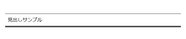
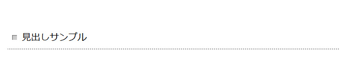
シンプルなボーダー見出し
ボーダー見出しサンプル(1)
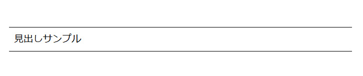
上下にボーダーを引いただけですがスタイリッシュに見えます。
h4.sample1{
    font-size: 1.5em;
    padding: 10px;
    border-top: 1px solid #000;
    border-bottom: 1px solid #000;
}
ボーダー見出しサンプル(2)
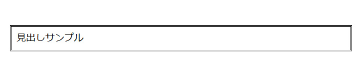
ボーダーでくるむとラベルに見えます。背景をつけてもいいかもしれません。
h4.sample2{
    font-size: 1.5em;
    padding: 10px;
    border: 3px double #000;
}
ボーダー見出しサンプル(3)
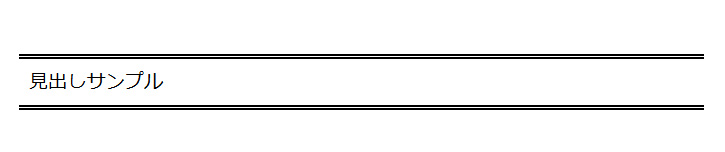
ボーダーを少し太くすると、それだけで存在感のあるラベルになります。
背景をつけるとマスキングテープにも見えるオシャレなデザインになります。
h4.sample3{
	font-size: 1.5em;
	padding: 10px;
	border-top: 5px double #000;
	border-bottom: 5px double #000;
}
ボーダー見出しサンプル(4)
上下のボーダーに緩急をつけると存在感が増します。
h4.sample4{
	font-size: 1.5em;
	padding: 10px;
	border-top: 1px solid #000;
	border-bottom: 5px double #000;
}
ちょっとアレンジしたボーダー見出し
ボタン風見出し

左上と右下のラインの種類を変えることでボタンのような雰囲気を出すことができます。
h4.sample5{
    font-size: 1.5em;
    padding: 5px;
    border: 10px double #ccc;
    border-right: 10px solid #ccc;
    border-bottom: 10px solid #ccc;
}
ドットが柔らかいボーダー見出し
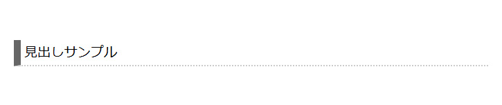
下線をドットにするとちょっとかわいくなりますよね。
h4.sample6{
    font-size: 1.5em;
    padding: 5px;
    border-left: 10px solid #666;
    border-bottom: 2px dotted #ccc;
}
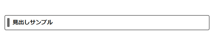
丸っこいボーダー見出し(1)
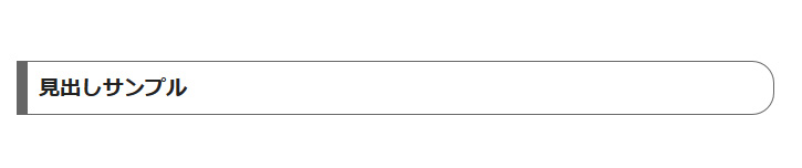
片側を丸っこくすると少し柔らかくなります。
フラットネイル風とでも言うんでしょうか。
h4.sample7{
    font-size: 1.5em;
    font-weight: bold;
    margin: 0 0 1.5em;
    padding: 10px;
    border: 1px solid #666;
	border-left: 10px solid #666;
    border-radius: 0 20px 20px 0;
    -webkit-border-radius: 0 20px 20px 0;
    -moz-border-radius: 0 20px 20px 0;
}
丸っこいボーダー見出し(2)

上線に厚みをもたせて下線を丸っこくしています。ラベルみたいですね。
h4.sample8{
    font-size: 2em;
    font-weight: bold;
    padding: 10px;
    color: #666;
    border: 1px solid #666;
    border-top: 5px solid #666;
    border-radius: 0 0 5px 5px;
    -webkit-border-radius: 0 0 5px 5px;
    -moz-border-radius: 0 0 5px 5px;
}
薄文字のボーダー見出し

文字を薄くした分文字サイズを大きくするといいかもしれません。
h4.sample9{
    font-size: 2em;
    font-weight: bold;
    padding: 10px;
    color: #fff;
    text-shadow: -1px -1px 1px #ccc, 1px 1px 1px #ccc;
    border-left: 10px solid #ccc;
}
飾り付きボーダー見出し
丸付ボーダー見出し
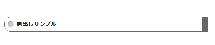
左側に丸みをつけた分右側をくっきり見せています。
h4.sample10{
    font-size: 1.5em;
    font-weight: bold;
    padding: 10px 0 10px 40px;
    position: relative;
    border: 1px solid #666;
    border-right: 20px solid #666;
    border-radius: 20px 0 0 20px;
    -webkit-border-radius: 20px 0 0 20px;
    -moz-border-radius: 20px 0 0 20px;
}

h4.sample10:before {
    background: #ccc;
    content: "";
    height: 20px;
    width: 20px;
    position: absolute;
    top: 50%;
    left: 10px;
    margin-top :-10px;
    border-radius: 15px;
    -webkit-border-radius: 15px;
    -moz-border-radius: 15px;
    box-shadow: 1px 1px 1px #666 inset;
    -moz-box-shadow: 1px 1px 1px #666 inset;
    -webkit-box-shadow: 1px 1px 1px #666 inset;
    -o-box-shadow: 1px 1px 1px #666 inset;
    -ms-box-shadow: 1px 1px 1px #666 inset;
}
四角付ボーダー見出し
下線だけよりもアクセントがついた方がオシャレに見えますね。
h4.sample11{
    font-size: 1.5em;
    padding: 10px 0 10px 30px;
    position: relative;
    border-bottom: 2px dotted #999;
}
h4.sample11:before {
    background: #ccc;
    content: "";
    margin-top : -5px;
    height: 10px;
    width: 10px;
    position: absolute;
    top: 50%;
    left: 10px;
    box-shadow: 1px 1px 1px #666 inset;
    -moz-box-shadow: 1px 1px 1px #666 inset;
    -webkit-box-shadow: 1px 1px 1px #666 inset;
    -o-box-shadow: 1px 1px 1px #666 inset;
    -ms-box-shadow: 1px 1px 1px #666 inset;
}
ライン付ボーダー見出し
文字を薄くした分文字サイズを大きくするといいかもしれません。
h4.sample12{
    font-size: 1.5em;
    font-weight: bold;
    padding: 10px 0 10px 25px;
    position: relative;
    border: 2px solid #666;
    border-radius: 5px;
    -webkit-border-radius: 5px;
    -moz-border-radius: 5px;
}
h4.sample12:before{
    background: #666;
    margin-top :-15px;
    height: 30px;
    width: 8px;
    content: "";
    position: absolute;
    top: 50%;
    left: 7px;
    border-radius: 2px;
    -webkit-border-radius: 2px;
    -moz-border-radius: 2px;
}
リボン風見出し
折り返し付リボン風見出し
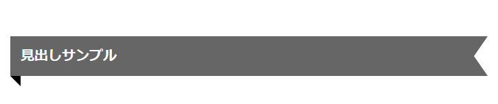
折り返しをつけるとよりリボンらしくなります。
h4のフォントサイズはピクセルで指定すると太さを調整しやすいです。
h4.sample13{
    font-size: 20px;
    font-weight: bold;
    background: #666;
    color: #fff;
    padding: 15px;
    margin-right: 30px;
    position: relative;
}
h4.sample13:before {
    width: 0;
    height: 0;
    content: " ";
    position: absolute;
    top: 100%;
    left: 0;
    border-style: solid;
    border-width: 0 15px 15px 0;
    border-color: transparent;
    border-right-color: #000;
}
h4.sample13:after {
    width: 0;
    height: 0;
    content: " ";
    position: absolute;
    top: 0px;
    left: 100%;
    border-width: 29px 20px;
    border-style: solid;
    border-color: #666;
    border-right-color: transparent;
}
丸付リボン見出し
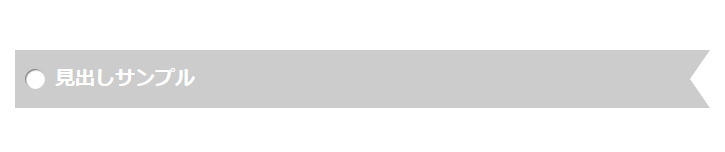
しおりにも見える丸付リボン風見出しです。
h4のフォントサイズはピクセル指定すると調整しやすいです。
h4.sample14{
    font-weight: bold;
    font-size: 20px;
    background: #ccc;
    color: #fff;
    margin-right: 30px;
    padding: 15px 15px 15px 40px;
    position: relative;
}
h4.sample14:before {
    background: #fff;
    margin-top :-10px;
    height: 20px;
    width: 20px;
    content: "";
    position: absolute;
    top: 50%;
    left: 10px;
    border-radius: 15px;
    -webkit-border-radius: 15px;
    -moz-border-radius: 15px;
    box-shadow: 1px 1px 1px #666 inset;
    -moz-box-shadow: 1px 1px 1px #666 inset;
    -webkit-box-shadow: 1px 1px 1px #666 inset;
    -o-box-shadow: 1px 1px 1px #666 inset;
    -ms-box-shadow: 1px 1px 1px #666 inset;
}
h4.sample14:after {
    content: " ";
    width: 0;
    height: 0;
    position: absolute;
    top: 0px;
    left: 100%;
    border-width: 29px 20px;
    border-style: solid;
    border-color: #ccc;
    border-right-color: transparent;
}
ラッピング風リボン見出し
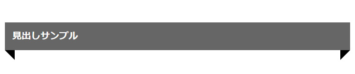
左右に折り返しをつけるとラッピング風にも見えます。
h4.sample15{
    font-weight: bold;
    font-size: 1.5em;
    background: #666;
    color: #fff;
    padding: 15px;
    margin: 0 -10px;
    position: relative;
}
h4.sample15:before{
    content: " ";
    width: 0;
    height: 0;
    position: absolute;
    top: 100%;
    left: 0;
    border-style: solid;
    border-width: 0 20px 20px 0;
    border-color: transparent;
    border-right-color: #000;
}
h4.sample13:after{
    content: " ";
    width: 0;
    height: 0;
    position: absolute;
    top: 100%;
    right: 0;
    border-style: solid;
    border-width: 20px 20px 0 0;
    border-color: transparent;
    border-top-color: #000;
}
吹き出し風見出し
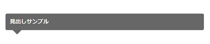
吹き出しに見えます。背景色などで特徴をつけるとカッコよく使えます。
h4.sample16{
    font-size: 1.5em;
    font-weight: bold;
    background: #666;
    color: #fff;
    padding: 15px;
    position: relative;
    border-radius: 5px;
    -webkit-border-radius: 5px;
    -moz-border-radius: 5px;
}

h4.sample16:after{
    content: "";
    margin-left: -15px;
    position: absolute;
    z-index: 90;
    bottom: -15px;
    left: 40px;
    border-top: 15px solid #666;
    border-left: 15px solid transparent;
    border-right: 15px solid transparent;
    border-bottom: 0;
}